IKEA Family
Smooth signup for the happiest family
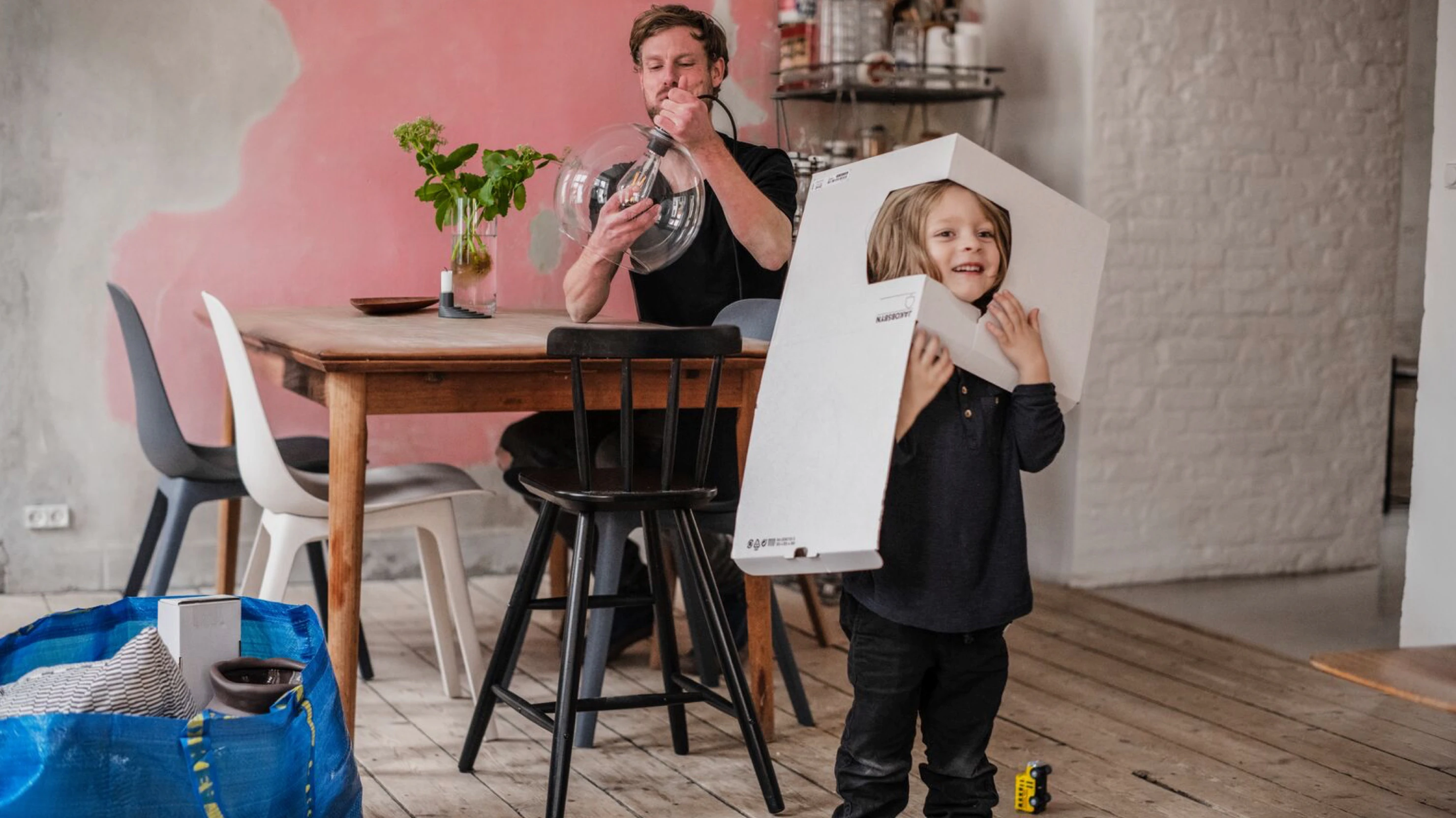
With over 4 million members, IKEA Family is the largest loyalty program of the Netherlands. Unfortunately a lot of those members are sleeping, and are not actively using their membership. Up to us to wake them up.

Easy peasy
For new members we also made it a lot easier. Signing up for IKEA Family should be a breeze. About time to redesign the signup experience thoroughly. Oh, and if we could do it within 4 weeks.

Ask first, shoot later
Before we started pushing pixels we wanted to be 100% sure our design fitted the target group. That's why we started with research. It consisted of a series of interviews with Family members and a journey mapping session. And we did a guerrilla style test in-store with my UX-research colleague. The result was a huge list of opportunities with which we quickly got on the right track.

No more bumps in the road
Do you want to make a user journey intuitive, natural and smooth? Then you should take away any bumps you can find. We started with the sign up form. We shortened it so customers only need to give the absolute necessary information. Once submitted a friendly and personal welcome e-mail is sent. With a fresh look and feel from yours truly.
Smooth landing
Also on the landing page we took away the bumps. We made it more clear and user-friendly. And a fresh coat of paint to fit the new IKEA Family branding. The result, clear information and actions for the user.

Landmark in the store
The IKEA Family kiosk is a real eye-catcher in the store. So we also gave this interface a refresh. We simplified the signup flow and pass request flow. With the new kiosk you can automatically receive your digital family pass by e-mail or SMS. So you never miss out on Family discounts again. Nice!

Teamwork makes the dream work
In this project there was close cooperation between design, research and copy. This way we could make smart design and copy decisions based on research insights. A nice example is the communication hook at the Kiosk. During research we noticed IKEA Family is mainly known for its free coffee and tea. So that's the first thing we grab new customers' attention with.
Cases